Wednesday, February 28, 2007
Tuesday, February 27, 2007
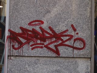
Graf artist terrorizes cow town

A coworker tipped me off to this article in the Hartford Courant of a graf artist terrorizing a cow town in Northern Connecticut.
Slideshow here.
Sunday, February 25, 2007
Like a Velvet Glove Cast in Lead
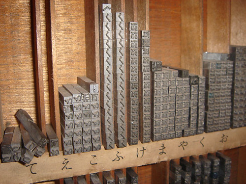
Space is at a premium (to say the least) here in Tokyo. Two weeks ago, we headed up to the Snow Festival in Hokkaido, one of Japan's northern islands, where things are a bit more spacious and they have taken the trouble to preserve historical stuff of interest to folks like us... namely, the oldest letterpress in Hokkaido.
Letterpresses are dying out faster here than in the U.S.- a lot of folks don't have any interest in "dead technology" , and most of the private presses in the Kanto Plain (Tokyo/Yokohama/Kawasaki) are long gone. Some of the only remaining ones:
http://www.kazuipress.com/
(These folks are associated with Akira Kobayashi, so don't be getting any smart ideas...)
http://www.nakamura-katsuji.com
http://homepage2.nifty.com/tsuyuki/insatsu/
"Teppan Insatsu" is the Japanese term for letterpress, or "活版印刷所" if you prefer.
The Hokkaido press is still in working condition, and boasts one of the oldest type collections in all of Japan.
It was pretty amazing. I uploaded a Flickr set for those interested to check out. Just hit the link above.

In other typographic news, the new issue of IDEA magazine is an all-Jan Tschichold issue. Ultra-ultra-rare reprints, rad essays, his original type designs, beautiful reproductions of his stunning book typography, and photos of him looking all weird and stuffy and anal. Just breathtaking. It even has a tipped-in reproduction of Tschichold's rad and ultra-prim evaluation of the form and use of the ampersand, translated into Japanese for the first time. Just bananas.
Check your better newsstands or hit me up if IDEA doesn't come to your town.
Saturday, February 24, 2007
Wednesday, February 21, 2007
Tuesday, February 20, 2007
Thursday, February 15, 2007
Cat and Mouse
Last month NPR's "This American Life" aired a story about The Vandal Squad, and Earsnot IRAK, in a segment entitled "Cat and Mouse." Its a good follow-up to The Infamy Documentary, for those of you who wondered about all the action video.
Infamy documentary
Part 1 of 10
Infamy documentary
Part 1 of 10
Wednesday, February 14, 2007
End to End
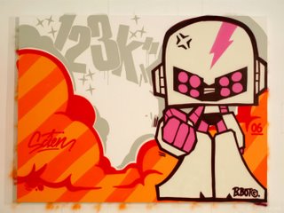
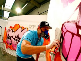
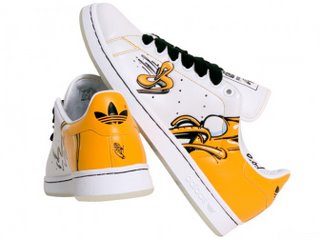
Just want to let you know that we (123klan) took part of "the end to end project" for adidas.
During 3 dayz we've been working with adidas on a whole collection (sneakers, tracktop and trainers)
Special shout outs to: sofarock, can2 atome, siluetta, smart1, skore and Jersey Joe.
You can check some exclusive pics at BKRW
Keep on rockin'
Sincerely yours
SCIENROCK™


g_images_groupes_nam_1850_rb_huge.jpg">

During 3 dayz we've been working with adidas on a whole collection (sneakers, tracktop and trainers)
Special shout outs to: sofarock, can2 atome, siluetta, smart1, skore and Jersey Joe.
You can check some exclusive pics at BKRW
Keep on rockin'
Sincerely yours
SCIENROCK™


g_images_groupes_nam_1850_rb_huge.jpg">


Tuesday, February 13, 2007
Monday, February 12, 2007
Friday, February 09, 2007
Thursday, February 08, 2007
A little off topic
Ex-Hardcore kids playing acoustic folk. Don't get me wrong, I like most of this trend. But I can't wait until some marketing genius or record label tries to carve out a niche for it and labels it something dumb like "Folkore" in the spirt of Horrorcore Rap, Crossover Metal, or Lupe Fiasco. What are they calling the Hip Hop/Hardcore-Danny-Diablo-Coka-Nostra thing?
Feeling these guys:
Joey Sems (SEMZ)
Walter Schreifels (From Gorilla Biscuits and Quicksand)
Chuck Ragan (From Hot Water Music)
Greg Graffin (of Bad Religion Fame)
Feeling these guys:
Joey Sems (SEMZ)
Walter Schreifels (From Gorilla Biscuits and Quicksand)
Chuck Ragan (From Hot Water Music)
Greg Graffin (of Bad Religion Fame)
Tuesday, February 06, 2007
Monday, February 05, 2007
Graf heads, meet the Letterheads
One of my favorite font foundries for the last few years has been Letterhead Fonts.

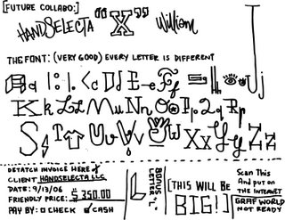
Letterheads is doing for signpainters what Handselecta is striving to do for graffiti writers. Collaborating with some of their industries most practiced talents, to create new fonts based on colloquial history.
The site certainly seems to cater to contemporary signmakers (almost more than graphic designers), which may account for some of the over-the-top heavily decorated treatments in the sample images. A lot of the type treatments are not exactly to my personal liking (some are a little too Nascar for me), but look past the sample images aand take a look at the actual typeface pages to see potential in these fonts that I believe are not found in many other places in the market. You'll be blown away with the unique qualities these typefaces present.
Awesome disply types for not just signage, but also garment graphics, identity and logo design, menu's. I can find infinite uses for some of these. These guys are not just offering great product, but they are preserving art in an artform that might die as the world moves more and more toward the digital. These styles are finding new life in vectors.
Need a new workhorse of a sans? Try Garner by Duncan Wilke.


A chunky round script ? Try Cosmic Cursive by Tom Kennedy.

A prety great gothic Stratford by Arthur Vanson)

Or peep Tonic by Tom Kennedy


Letterheads is doing for signpainters what Handselecta is striving to do for graffiti writers. Collaborating with some of their industries most practiced talents, to create new fonts based on colloquial history.
The site certainly seems to cater to contemporary signmakers (almost more than graphic designers), which may account for some of the over-the-top heavily decorated treatments in the sample images. A lot of the type treatments are not exactly to my personal liking (some are a little too Nascar for me), but look past the sample images aand take a look at the actual typeface pages to see potential in these fonts that I believe are not found in many other places in the market. You'll be blown away with the unique qualities these typefaces present.
Awesome disply types for not just signage, but also garment graphics, identity and logo design, menu's. I can find infinite uses for some of these. These guys are not just offering great product, but they are preserving art in an artform that might die as the world moves more and more toward the digital. These styles are finding new life in vectors.
Need a new workhorse of a sans? Try Garner by Duncan Wilke.


A chunky round script ? Try Cosmic Cursive by Tom Kennedy.

A prety great gothic Stratford by Arthur Vanson)

Or peep Tonic by Tom Kennedy

Friday, February 02, 2007
Flatbush's best kept not so secret
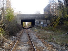 Pardon the tongue twister above. Peep this and the other images that URBANSCRAWL has in their sets. Kinda reminds me of DC's secret chill spots for day painting. Remember those days old guys?
Mouneer El Shaarani


Ok, so I stole this post from Chris Papasadero at K10K. Credit where its due in this practice of link posting. But I couldn't resist. El Shaarani's work is just so dope. I know Sabe's into this stuff....


 MR.H hatin with a smile.
